As you’re maybe already aware, this endless torrent of information known as “data” is one of our greatest passions here at OWNI. As it seems you lot are quite interested in it too, we thought we would share a few of our favourite examples of data-journalism on the web each week.
________________________________________________________________________________________
For our inaugural homage to data we head first to Spain, and not just because it hosted the G20 summit in Cannes this year. On our Iberian menu this week we’ve got a bit of Open Data, a few great visualizations and some fine examples of mapping.
Mi data es tu data
“Datos.gob.es is the national portal that manages and organizes the Catalog of Public Information on the General Administration of the State.” It just opened its doors in beta, and so far you can browse just under 500 data sets. They’re catalogued with the clear intention to use the most universal formats available – a major challenge as David Eaves explained in recent weeks. A simple sign-up on the site allows you to reuse the data freely and to suggest web or mobile applications to the community (which are of varying degrees of usefulness, as is the nature of these things). But the intention is certainly there, as evidenced by the excellent site La Lista De La Compra (“The Shopping List”), which introduces a long line of citizen initiatives made possible by the opening up of data.
![Datos]() Cadiz: the brand
Cadiz: the brand
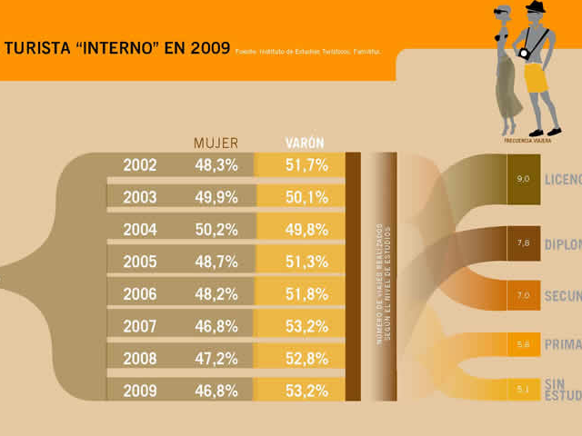
Such a major tourist destination couldn’t in good conscience deprive itself of a colorful site to extol the most virtuous of its industries. Not surprisingly then, the lovely Spanish Tourism in Figures was created to celebrate the 60 million annual visitors who bring prosperity (relatively speaking) to the land of the football world champions. Many of the visualizations contain invisible data sets (at least we assume they’re invisible), and the JPEG compression rate of the images leaves a lot to be desired. Nevertheless, we should at least recognize the comprehensiveness of the work as a whole and the huge creative job of laying out data that combines geographical, economic, social and human parameters.
How much do the Iberians make
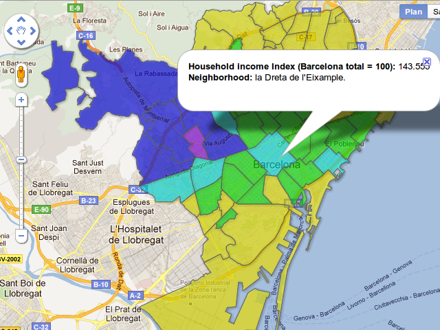
Much more modest – and not really in Spain, some would say – is this small map that visualizes Barcelona in terms of the income of its residents by questioning the impact of recent urban projects. This simple piece of mapping created with Google’s Map Maker is a convincing illustration of the willingness to offer new tools to journalists today, and points out one of those tools. This Catalan exercise came about at the conclusion of a workshop set up by Carlos Alonso during last year’s media140 – under the patronage of the most famous data journalist in Europe, Simon Rogers – in collaboration with the Barcelona Open Data site.
Where do the rich live?
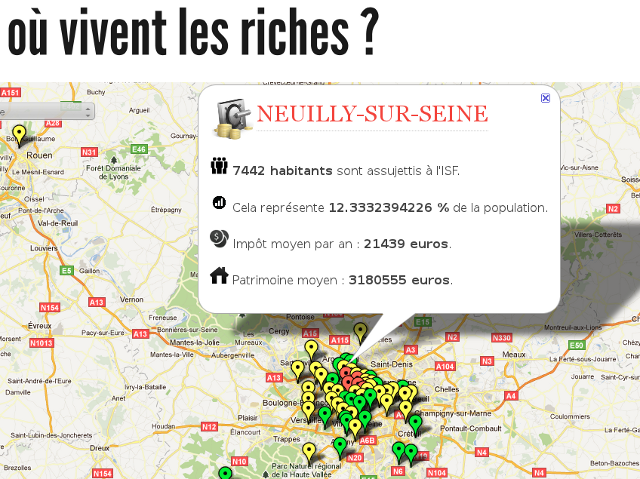
Another use of Google Maps, another treatment of data – and again from the perspective of mapping society through the wealth of its citizens. The application Where do the rich live? answers its own question regarding the 100 biggest cities in France (those that have more than 20,000 inhabitants according to the exercise, which causes a slight bias in the map) using the French Ministry of Budget’s ISF (the annual direct wealth tax in France on anyone who has assets in excess of €800,000) data from 2009, as released by the site Data Publica. The map is the work of Jean Abbiateci, and is accompanied by an article on its methodology by Benjamin Gans.
Who’s Occupying Wall Street?
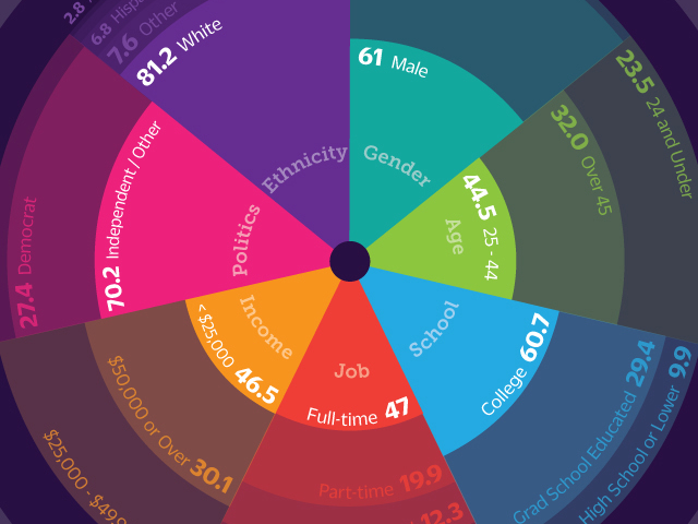
The infographic Who Is Occupy Wall Street? is the result of a study carried out by occupywallst.org. The site received nearly 5 million unique visitors between mid-September and late October, and has surveyed 5,000 of those visitors. The typical profile that emerges from this special #OWS dataviz is a white male aged between 25 and 44, neither Republican nor Democrat and with a fairly poorly paid job. There’s lots of other nice extras to discover in the methodology and the breakdown of this elegant infographic.
We are the 99% + 1%
Three other projects caught our attention this week, offering proof (if it was still needed) that population censuses are one of creative data geeks favorite things to play with.
In this first video, Visualizing How A Population Grows To 7 Billion, Adam Cole and Maggie Starbard of NPR have (probably a lot of) fun simulating the evolution of the world’s population using colored liquids flowing through holes in glasses calibrated to data about the demographic shifts of the continents over time. The result is not only understandable at first glance – the most important quality of data representation – it’s also elegant.
Click here to view the embedded video.
This first video made us want to highlight again an old gem. Whether you’ve seen it already or not, the brilliant Hans Rosling and his explanation of world population growth is always a pleasure to watch. Datavision, as taught by the master David McCandless, involves some good data, a beautiful vision, and the talent to bring the whole thing together. And it definitely takes talent to get an audience excited using only plastic boxes from IKEA.
Click here to view the embedded video.
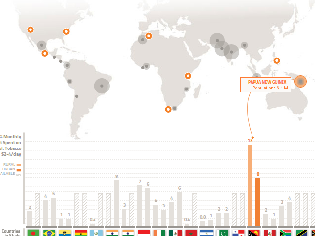
The final demographic application is the Poor Economics site which accompanies the publication of the book of the same name by Abhijit Vinayak Banerjee and Esther Duflo – French winner of the Clark Medal and a veteran of TED Talks. For those of you familiar with the slightly technical visualizations of UNESCO’s department of Deprivation and Marginalization in Education, these are similar but simpler and therefore much better. Concerning a series of daily life criteria such as consumption, health, education and micro-finance, developing countries are examined and analyzed in order to better understand the individual needs of each country. So we learn that inhabitants of rural Papua New Guinea living on $2 – $4 a day spend an average 13% of their monthly budget on alcohol and tobacco (see below). With this type of ultra-technical data, coming up with a representative model is far from easy: this site does it very successfully. And the fact that they created it in HTML5 rather than Flash is the icing on the cake.
Just do it
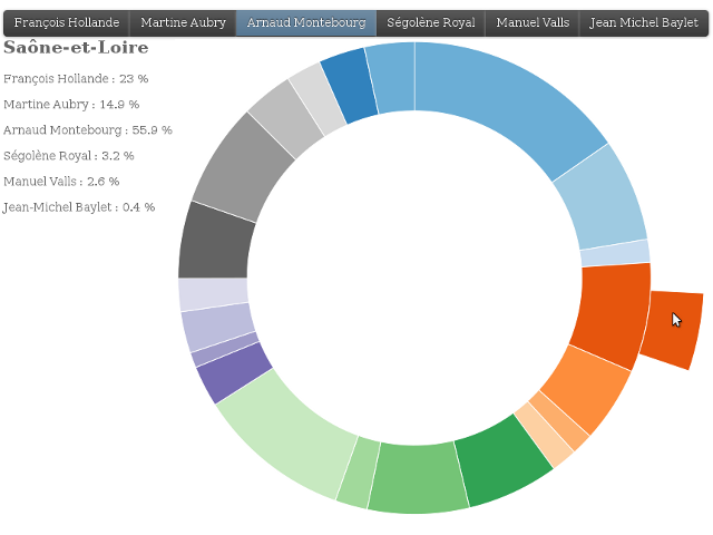
A final shout out this week for Étienne Côme’s “the Socialist primary Dataviz”. He wanted to cross-reference the data from the results of the first round of the French Socialist Party’s primaries with socio-geo-demographic data from various Insee sources, and to have some fun fiddling with the Javascript library d3. So he created four very effective visualizations – a map, a box plot, a treemap and a sunburst. It’s a remarkable piece of work.
________________________________________________________________________________________
Follow OWNI’s data team on Twitter: @pdatha, @mariecoussin, @juliengoetz & @nicolaspatte
